The Color of the Year: Grass
The Color of the Year is a POSER
January 18, 2017
Every year since 2000, Pantone has released their Color of the Year and this has become an faithfully awaited annual tradition. This color holds the power to influence everything from fashion, to makeup, to product and interior design. The color sets a tone (haha) for the entire year in the fashion industry, as it is likely that all other popular colors will revolve around pairing with the Color of the Year.
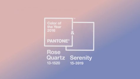
This year, Pantone has released their color, and my words can be summed up quite well in a single word: disappointment. After the iconic year of 2016 where Pantone released, for the first time ever, two colors (Rose Quartz and Serenity), some of the most impactful colors they have ever released, creating waves of influence as far beyond the norm. Weddings were done in the name of these colors. Some even stretch as far to say that it was an iconic moment for gender equality as the atypical colors for a boy and girl were presented on the same playing field, as equals.
So, my feelings are a bit justified when Pantone gives us Greenery for 2017. Greenery is a lime green with pale, yellow undertones. This is the color they have given us to design weddings, homes, beauty products, and clothing after in 2017. The only trend pointing to this color would be the indie fascination with succulent cactus plants, however, fashion trends and tabletop decorations are very different things. When every fashion designer from Elie Saab to Michael Kors is pointing towards a deep purple, I’m having trouble understanding why they chose this shade of green when the only prominent designer who featured this color was Gucci. Which does not come as a surprise, as they have featured this color for the last four years.
This color is not new, nor is it iconic. I’m not quite sure if it was taken into consideration when Greenery was chosen, but the whole Reduce, Reuse, Recycle campaign is nearly a decade old. This color has already surfaced, lived to it’s peak and died off, as it should have. I can distinctly remember wearing a shirt that was exactly this hue in 2008 that had THINK GREEN printed on the front in thick, white ink. To ironically try to revive this color, as revive is one of the main themes of Greenery, is like attempting to pull a sunken ship out of the ocean and sending it out to sea again without fixing the damage. Literally beige would have been a better color, and everyone knows that the Kardashian sisters failed to make all-beige outfits a successful trend nearly nine months ago.
All that I can conclude is that I’m having terrible flashbacks to 2013 when everything in every store was faux gem-tones because the color was emerald. I’d like to believe that this a joke, and that I will wake up tomorrow and this was a dream and the color would be the vastly predicted deep purple. However, as this article is reaching a conclusion, I’m realizing how far off of a dream that is. So, I’ll leave you with a picture of the famous colors from 2016 while I excuse myself to change into black as I mourn the passing of an iconic year in color.